Simple branding
There is an entire branding section in the appConfig section of DevPortal configuration that lets you pick one of the pre-defined theme variants and its light/dark options, allowing you top customize every single aspect from it.
The default config
Our default values for Helm chart install are:
upstream:
  backstage:
    appConfig:
      app:
        branding:
          fullLogo: https://veecode-platform.github.io/support/logos/logo.svg
          fullLogoDark: https://veecode-platform.github.io/support/logos/logo-black.svg
          iconLogo: https://veecode-platform.github.io/support/logos/logo-mobile.png
          fullLogoWidth: 150
          theme:
            light:
              variant: "backstage"
              palette:
              navigation:
                background: "#222222" # your fixed light theme sidebar background
            dark:
              variant: "backstage"
              palette:
              navigation:
                background: "#222222" # same fixed color for dark theme
      backend:
        csp:
          img-src: ["'self'","data:","https://raw.githubusercontent.com/","https://avatars.githubusercontent.com/","https://veecode-platform.github.io","https://platform.vee.codes"]
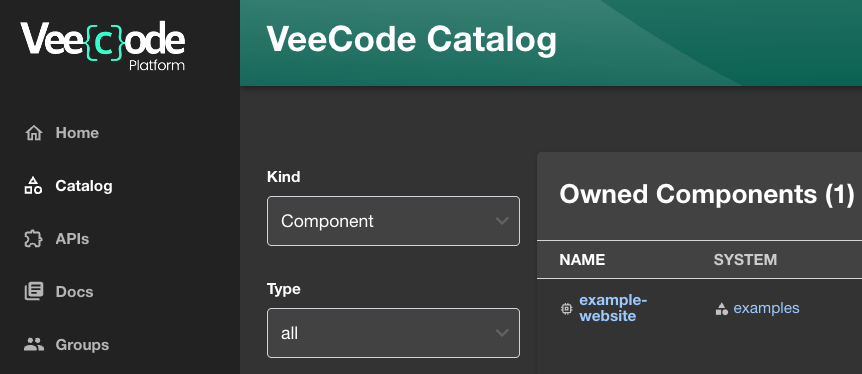
Will result in this:

A few points to remember:
- You can provide URLs to your custom resources, but remember those must be available to end users' browsers.
- You must add the base URL of those resources to the
csp.img-srclist.
A Simple config
A simple and funny config just to show some settings change:
app:
  branding:
    theme:
      light:
        variant: "backstage"
        typography:
          fontFamily: "Verdana"
          htmlFontSize: 20 # smaller is bigger
          h1:
            fontFamily: "Comic Sans MS"
        palette:
          text:
            primary: "#000066"
            secondary: "#0099ff"
      dark:
        variant: "backstage"
        typography:
          fontFamily: "Verdana"
          htmlFontSize: 20 # smaller is bigger
          h1:
            fontFamily: "Comic Sans MS"
        palette:
          text:
            primary: "#ffcc00"
            secondary: "#0099ff"
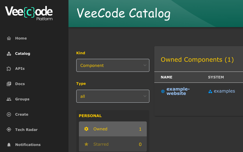
Will result in this:

Other examples
A complete config for the "backstage" variant theme settings is below (obtained from RHDH: Default Backstage theme color palette):
Most of RHDH theme settings are also available in the DevPortal, feel free to try them. We have made our "home" and "header" plugins compatible with RHDH, so chances are you will be ok. The RHDH theme variant "rhdh" is also available in the DevPortal, but we like "backstage" better.
app:
  branding:
    theme:
      light:
        variant: "backstage"
        mode: "light"
        palette:
          background:
            default: "#F8F8F8"
            paper: "#FFFFFF"
          banner:
            closeButtonColor: "#FFFFFF"
            error: "#E22134"
            info: "#2E77D0"
            link: "#000000"
            text: "#FFFFFF"
            warning: "#FF9800"
          border: "#E6E6E6"
          bursts:
            backgroundColor:
              default: "#7C3699"
            fontColor: "#FEFEFE"
            gradient:
              linear: "linear-gradient(-137deg, #4BB8A5 0%, #187656 100%)"
            slackChannelText: "#ddd"
          errorBackground: "#FFEBEE"
          errorText: "#CA001B"
          gold: "#FFD600"
          highlight: "#FFFBCC"
          infoBackground: "#ebf5ff"
          infoText: "#004e8a"
          link: "#0A6EBE"
          linkHover: "#2196F3"
          navigation:
            background: "#171717"
            color: "#b5b5b5"
            indicator: "#9BF0E1"
            navItem:
              hoverBackground: "#404040"
            selectedColor: "#FFF"
            submenu:
              background: "#404040"
          pinSidebarButton:
            background: "#BDBDBD"
            icon: "#181818"
          primary:
            main: "#1F5493"
          status:
            aborted: "#757575"
            error: "#E22134"
            ok: "#1DB954"
            pending: "#FFED51"
            running: "#1F5493"
            warning: "#FF9800"
          tabbar:
            indicator: "#9BF0E1"
          textContrast: "#000000"
          textSubtle: "#6E6E6E"
          textVerySubtle: "#DDD"
          warningBackground: "#F59B23"
          warningText: "#000000"

      dark:
        variant: "backstage"
        mode: "dark"
        palette:
          background:
            default: "#333333"
            paper: "#424242"
          banner:
            closeButtonColor: "#FFFFFF"
            error: "#E22134"
            info: "#2E77D0"
            link: "#000000"
            text: "#FFFFFF"
            warning: "#FF9800"
          border: "#E6E6E6"
          bursts:
            backgroundColor:
              default: "#7C3699"
            fontColor: "#FEFEFE"
            gradient:
              linear: "linear-gradient(-137deg, #4BB8A5 0%, #187656 100%)"
            slackChannelText: "#ddd"
          errorBackground: "#FFEBEE"
          errorText: "#CA001B"
          gold: "#FFD600"
          highlight: "#FFFBCC"
          infoBackground: "#ebf5ff"
          infoText: "#004e8a"
          link: "#9CC9FF"
          linkHover: "#82BAFD"
          mode: "dark"
          navigation:
            background: "#424242"
            color: "#b5b5b5"
            indicator: "#9BF0E1"
            navItem:
              hoverBackground: "#404040"
            selectedColor: "#FFF"
            submenu:
              background: "#404040"
          pinSidebarButton:
            background: "#BDBDBD"
            icon: "#404040"
          primary:
            dark: "#82BAFD"
            main: "#9CC9FF"
          secondary:
            main: "#FF88B2"
          status:
            aborted: "#9E9E9E"
            error: "#F84C55"
            ok: "#71CF88"
            pending: "#FEF071"
            running: "#3488E3"
            warning: "#FFB84D"
          tabbar:
            indicator: "#9BF0E1"
          textContrast: "#FFFFFF"
          textSubtle: "#CCCCCC"
          textVerySubtle: "#727272"
          warningBackground: "#F59B23"
          warningText: "#000000"
Please understand the file above is just a dump of the "backstage" variant's default values. You can simply refer to it and the default values will apply:
app:
  branding:
    theme:
      light:
        variant: "backstage"
        mode: "light"
      dark:
        variant: "backstage"
        mode: "dark"